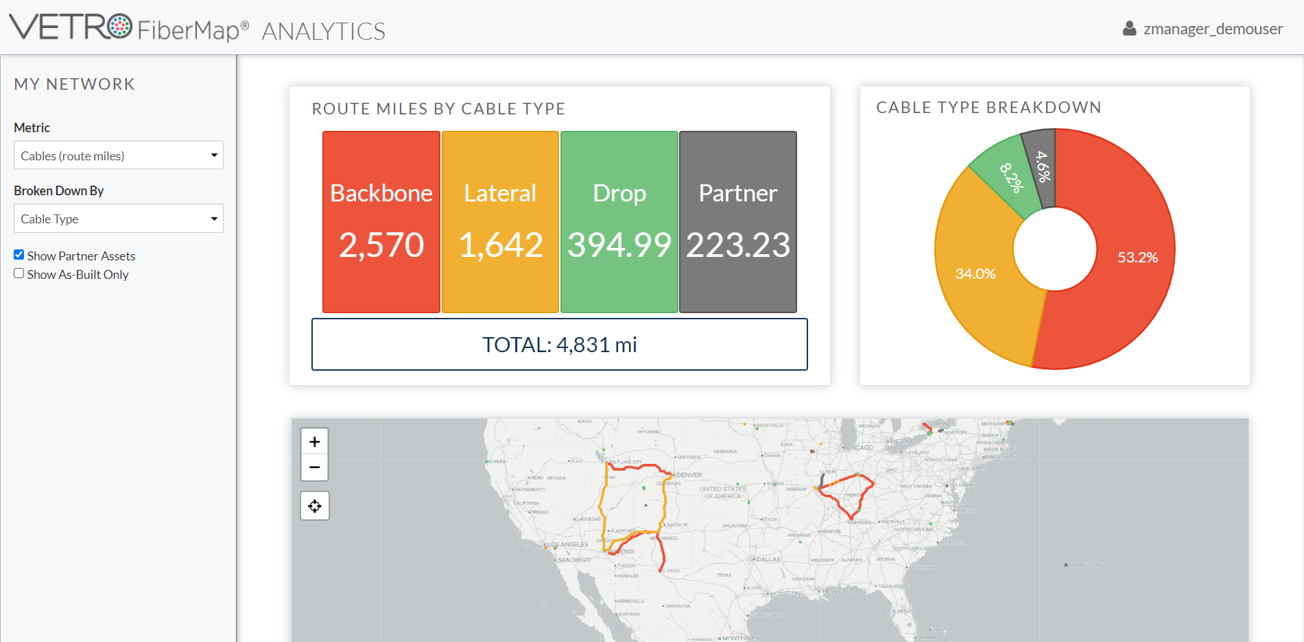
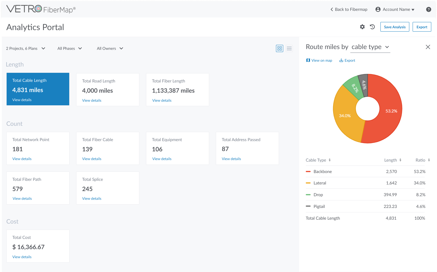
In October 2022, our team embarked on a journey to reimagine our analytics dashboard. It started with feedback from our manager—clients were looking for a holistic and in-depth view of their systems to support high-level decision-making. As their needs became clear, our mission was set: build a dashboard that provides managers with essential insights, trends, and a vision for the future. (Image 1).
Understanding User Needs: Insights from the Field
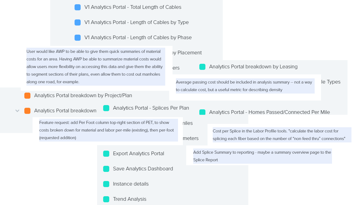
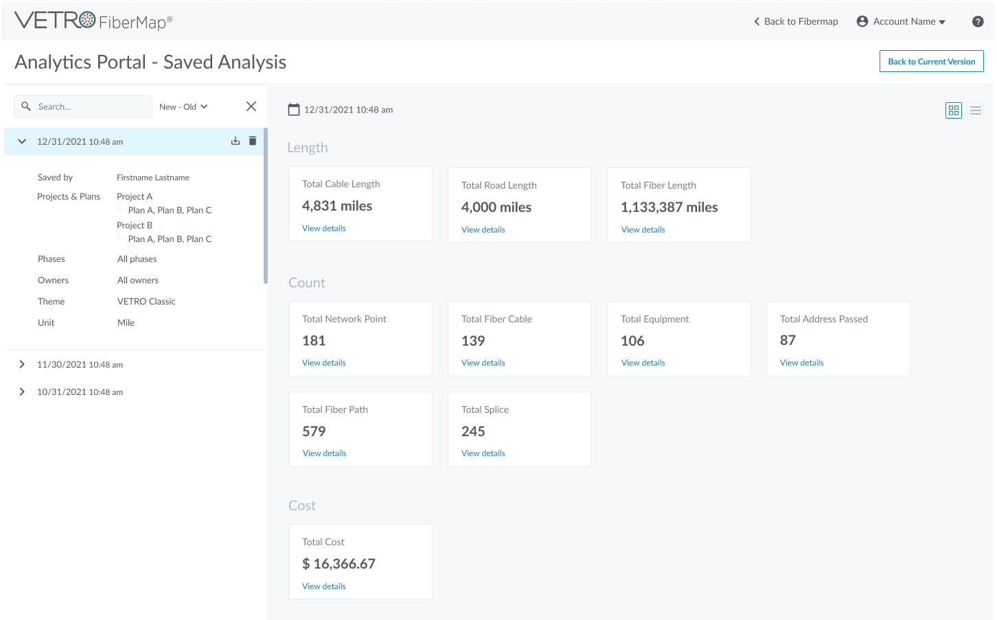
Our first step was diving into user feedback. Support tickets revealed that customers wanted more than just a snapshot; they needed financial management tools to break down costs by category—splices, material, labor, and additional expenses. Trend analysis was another must-have, allowing managers to see patterns over time. And they needed flexibility: the ability to save and export data for reporting and collaboration. (Image 2).
Image 2. User Feedback Tickets from our support team.
Learning from the Competition: Benchmarking Ideas and Best Practices
To get a broader perspective, we examined competitor dashboards. 3GIS, a major player in geospatial analytics, offered a map-based dashboard with essential data displayed through charts and graphs, while CHR’s real-time project dashboard kept clients updated on construction progress with a sizable, customizable map. Beyond our niche, we looked to Tableau’s data visualization tools, known for their interactivity and user engagement, as a benchmark for user-friendly design. (Image 3).
Image 3. Different designs of analytic dashboards.
Brainstorming Solutions: Ideation Phase
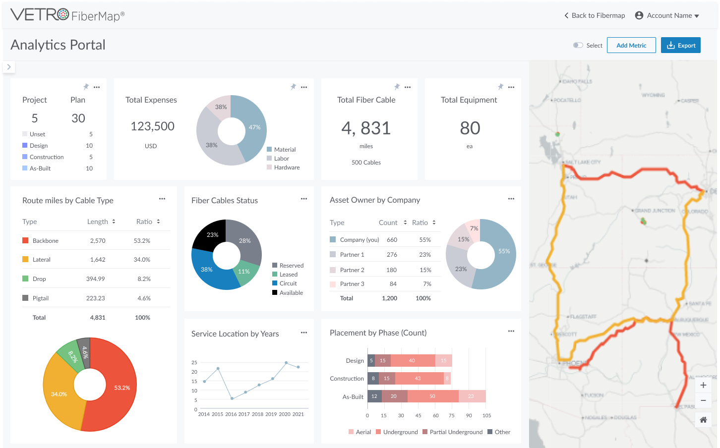
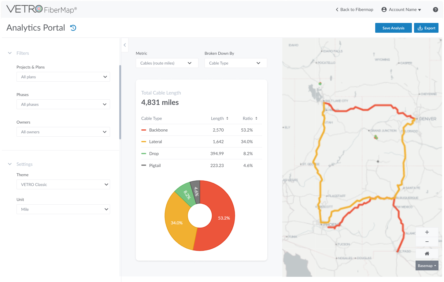
With inspiration in mind, we sketched out several ideas. My initial concept featured a customizable dashboard with “pinned” metric blocks that allowed users to prioritize information. A collapsible filter panel would allow them to adjust metrics in real time, while export options streamlined data sharing. A map view anchored one side of the dashboard, giving users context alongside the metrics. (Image 4). My colleague had a different approach: a two-column dashboard featuring collapsible sections for filters, metrics, and map views. Her idea also included a “save analysis” feature, akin to version control so that users could revisit data snapshots over time. (Image 5).
Image 4. Idea sketches and mockup. Block design with multiple customized metrics.
Image 5. Design that allows users to focus on the graphs in the middle of the screen.
Iterations and Refinement: Striking the Right Balance
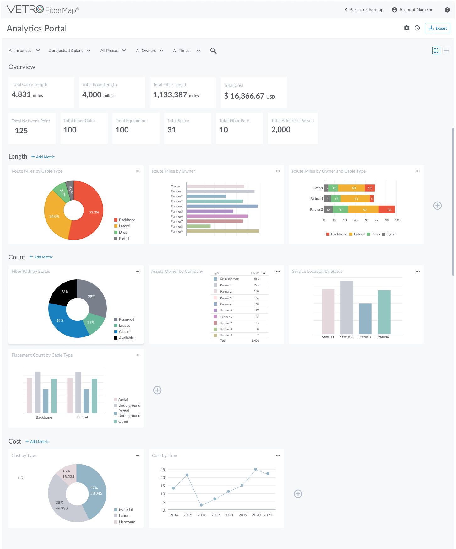
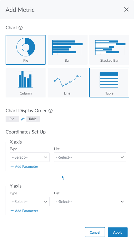
As we evaluated both designs, we identified which elements worked best and where we could simplify. Some ideas, like advanced metrics customization and bulk selection, felt premature for the first version given timeline constraints. Ultimately, we landed on creating two versions: a streamlined “basic” version and a more feature-rich “advanced” dashboard.
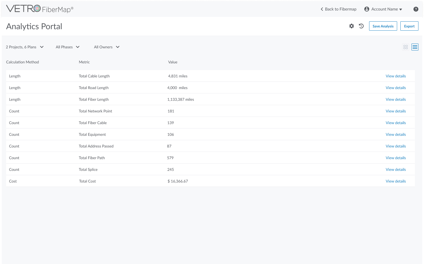
The layout needed a rethink, too. My original design risked looking cluttered with more metrics. By organizing data into categories and offering a toggle between block and table views, we aimed for a cleaner, more navigable experience. The advanced version featured an overview section at the top, offering a quick, holistic snapshot. (Images 6 and 7).
Image 6. The basic version of the design with fixed categories for limited types of metrics.
Image 7. The advanced version of the design. Users could customize metrics and have a timeframe filter.
Future Work: Engaging Users for Final Refinements
With our manager’s approval, our next step is the most exciting—gathering user feedback. Hearing directly from clients will help us fine-tune the dashboard, ensuring it not only meets their immediate needs but also grows with their evolving requirements. From here, we’re eager to continue refining the analytics dashboard, keeping an eye on future needs as we work to create a truly forward-thinking tool.


